
The fashion store for
minimalists.
Overview
Yugen Apparels is a minimalist-focused online apparel store. I joined the team as an intern to redesign the company website and build a new brand identity. I closely worked with the founders and a small team of developers to develop the website.
Role
Duration
Apr 2020 - Feb 2021
Project Type
Internship
The Brief
Redesign the customer side of the website to make it more user friendly for both new & returning customers, also to improve user flows for frequently used tasks.

Desk Research
Yugen Apparels, established in 2013, is a fashion e-commerce store that has served over 3,500 consumers and earns over ₹1,20,000 per year in profit. There were roughly 500 recurring customers, and the bulk of them were between the ages of 18 and 35 because the items primarily catered to young working professionals and college students.

Current Website Analysis
Before beginning any form of research, I decided to use the website to look up for common usability issues.


Competitive Analysis
A competitive analysis assisted in determining where the present product and design stand in the market, as well as understanding the competition's strengths and flaws. Finding market gaps will allow for the introduction of new and useful features to the user, resulting in a more intuitive and improved user experience.


User Survey
To increase our understanding of the audience, and verify assumptions that would help in better understanding of the areas of focus for research, a survey was conducted with the customers, around 120 responses were collected.


Usability Testing
To better understand the interface's efficiency and user satisfaction, five individuals were approached for an usability test. Their actions and emotions were observed throughout the test.


Listing Project Goals
Before moving ahead, I decided to gain a clear perspective of business goals and user goals, as well as some of the technical considerations for the new website.

Problem Solution Matrix
The venn diagram assisted us in visualising the challenges, after which they were thoroughly studied and potential solutions for each of them were chosen following many brainstorming sessions and discussions with the entire team. Solutions were either implemented or suspended as we worked on the final product, depending on the effort to impact ratio.

Task Flow
With the project goals in mind, I created a task flow to demonstrate the ideal path that a user would take to complete a task on the website. I concentrated on finding and purchasing an item from the website. Working on this helped me in identifying the essential screens for my design.

Information Architecture
I recreated the IA after analysing the solutions and conclusions from the previous steps. Its primary goal was to streamline user journeys and provide the website a proper structure so that users would spend less time and effort shopping.

Branding
Yugen Apparels is an Indian Merchandise Store that sells premium clothes with simple and minimal designs for targeted towards college students & working professionals.

Design Language
To make the website more consistent and memorable, a new design language was used. The primary aspects considered when settling on the language were accessibility and inclusivity. Throughout the website, I adhered to Google's Material Design principles.


The Navigation
Based on the new Information Architecture, a fresh new navigation menu with hover animations was designed. Indicators for new collections have also been included. It also included a featured product along with it’s price.

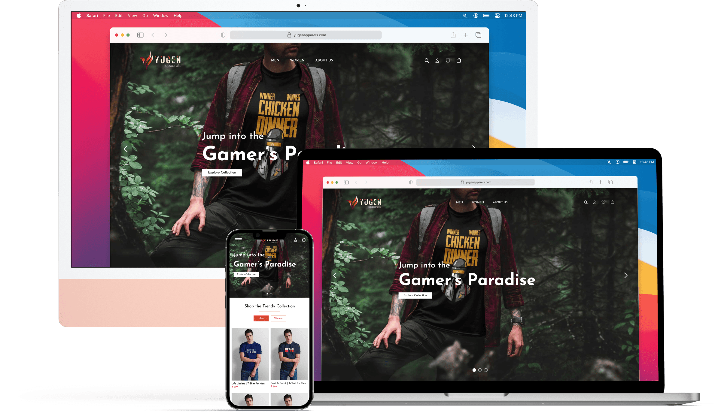
The Landing Page
We finally landed on this layout after several iterations, discussions with the team, and small adjustments. The primary goal was to create simple and a less cluttered landing page with beautiful photographs that highlight the product.

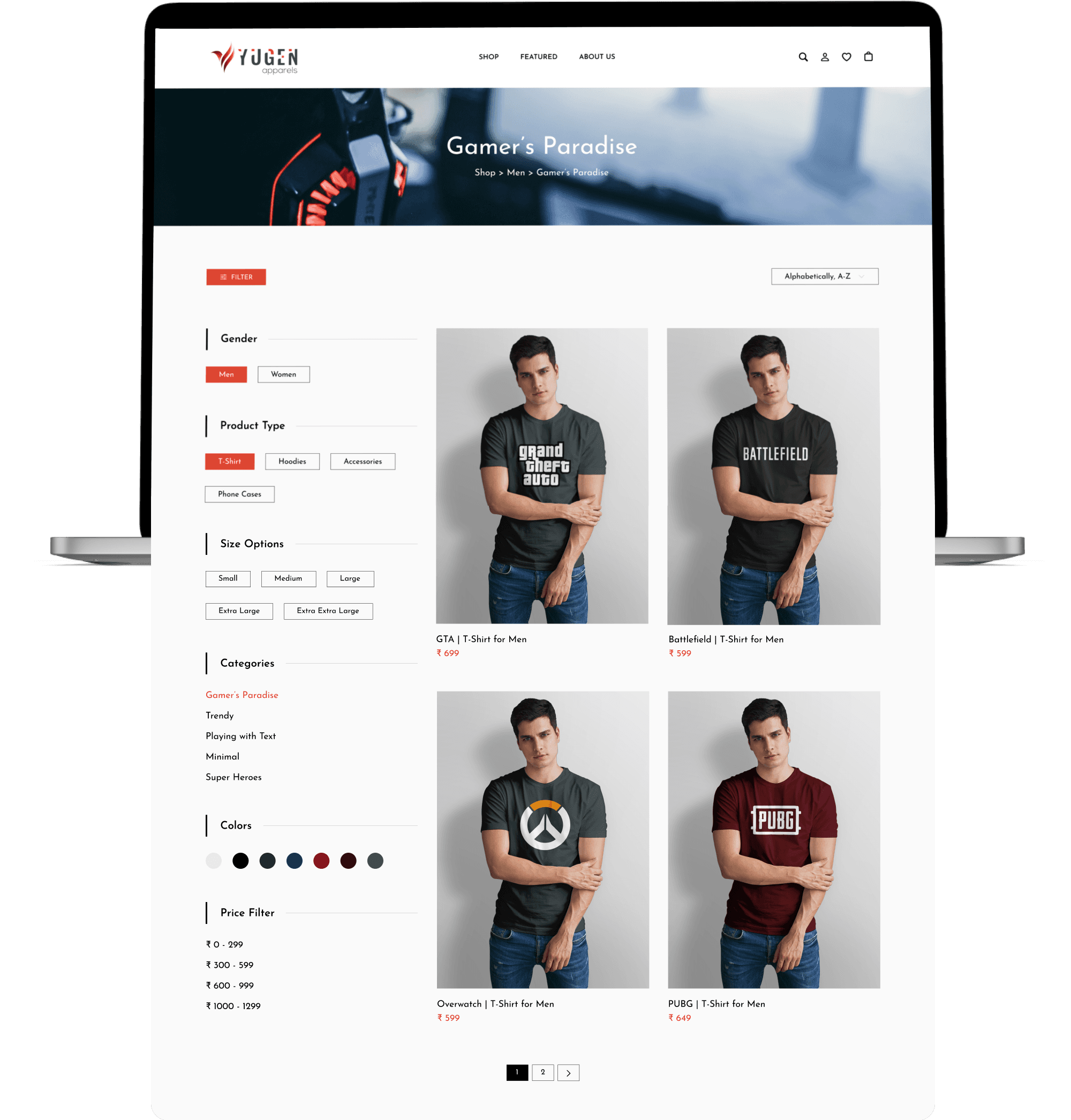
Filter Options
Added the filter and sort options on the top section of the page such that the user is able to find it more easily and find products effortlessly.
The Product Page
While creating the product page the main aim was to create an intuitive design that is familiar. People that buy online are used to a specific user experience, so it was necessary to use the common rules of E-Commerce design.
I used the Inverted Pyramid Principle to present information, beginning with the most significant and demanding aspects and progressing to more detailed details revealed afterwards.
We decided not to include the user reviews part because there were none at the time of launch, but it was put above the similar products section after a while.

The Checkout Flow
The checkout process is the most critical component of an ecommerce website. My design goal was to eliminate unnecessary distractions so that the user could focus on his or her task at hand. Most importantly, it was about making it simple, since the faster a customer can check out, the happier they will be, and the faster we will close the transaction.
See the functional prototype for the checkout process here.
Moibile Version
Whether it is the mobile version or the tablet version of the website, all of the pages have been designed with the same level of detail & ensured that it is responsive in every aspect.

Usability Testing
As the final step in the design process, I conducted usability testing using the desktop & mobile prototype simultaneously. It was conducted to test the flow of design, ease of navigation, and the extent to which the design accurately reflects the brand’s values. The test was also used to see whether the design solves the user’s needs and pain points that were captured during the research phase.
I decided to assign the same tasks that I had previously assigned to users for the old website and collect feedback for the newly redesigned website. Using this method, I was able to validate whether or not the new version of the website was actually solving the problems that users were experiencing previously.


Priority Revisions
There were some issues with the redesigned version that I came to know during the user feedback usability testing and decided to fix them before handing off the design to the developers.


As all of the issues were minor design flaws that had no effect on the overall userflow of the website, I chose not to conduct another round of user testing and instead submit the design to the developers.
After completing the entire design work it took another 2 months to create the product as both the engineers were interns and lacked experience.
Results
Within just three months of the new website's launch, the total revenue of the website climbed by more than 59%.
Website impressions from Instagram advertisements increased by more than 67% after the launch of the new website.
The proportion of returning clients rose by 43% as well.
I also made the decision to send the same survey ( used initially to uncover problems with the earlier website ) to the new clients. This time, we had received an overall rating of 4.3 as opposed to the older website's 2.4.


Satya was a wonderful addition to our team. He was extremely helpful and contributed significantly to our success. He did an incredible job redesigning our website and is an excellent collaborator who can turn even the most basic ideas into something truly remarkable.
Dr. Rohan Kanheya
Co - Founder at Yugen Apparels
Learnings
Working in an early-stage startup was extremely difficult. I learned when and where to focus my efforts from this amazing experience.
During my internship, I learned a lot of things that were outside my scope. I learned about digital marketing, social media marketing, inventory management, gathering consumer feedback, etc.
I had a great time working with some of the best people, who have consistently shown me their support and confidence.
Some key takeaways from this project are :
Don't worry too much about the detail : Earlier in my journey, I made the mistake of worrying about the look of the UI. Taking a step back and reassessing the user pain-points helped me to reprioritise the UX.
Focus on the problem : At the end of the day, it is your users pains that you will be solving for so keeping that front of mind is important as it's easy to lose sight of this when you're bogged down in the day to day.
Thank You
Hope you liked the project.


